
The Sunshine Coast’s vibrant landscapes offer a unique canvas for exploring the fascinating world of colour psychology. From the golden sands of Mooloolaba Beach to the lush green hinterlands, our local region is a kaleidoscope of influential hues. But you may be surprised to learn that these colours influence our daily lives in subtle yet powerful ways.
If you’re just starting your business or are in the midst of a website overhaul, brand colours can be tempting to skim through. But in the fast-paced world of marketing, every detail matters. From catchy slogans to captivating visuals, businesses have a short window of time to leave a lasting impression on their target audience. This is where colour psychology plays to your advantage as a business owner.
Keep reading to learn how the right brand colours can influence emotions and influence consumer behaviour. Afterwards, you’ll be able to identify the colours that will best drive sales to your Sunshine Coast business.
How to Use Colour Psychology to market your sunshine coast business
Colour psychology explores how different colours affect human emotions and behaviours. In your day-to-day activities, you may absorb hundreds of brand colours that were designed to target your emotions.
Each colour has its own unique psychological associations and can evoke specific feelings and perceptions. By understanding and applying these colour principles, you can enhance your marketing strategies and create a more compelling brand presence on the Sunshine Coast.
Red
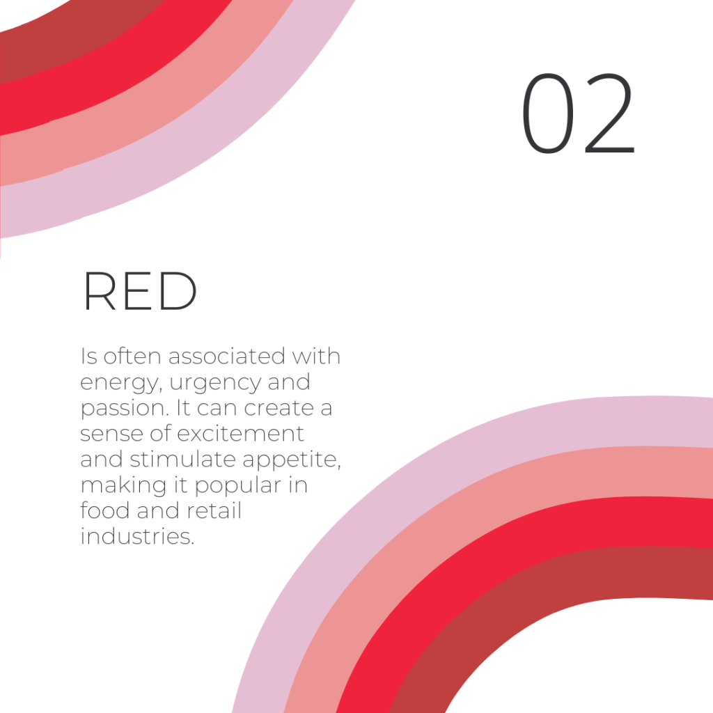
The colour red is associated with energy, urgency and passion. It creates a sense of excitement and stimulate appetite, making it popular in food and retail industries.
For this reason, many local restaurants and cafes use it in their branding. You might spot this energetic hue in the signage of popular eateries along Bulcock Street in Caloundra.
For example, you’ll see red hues cascade across the intimate dining area of Amici Restaurant and Pizzeria. They get an extra marketing boost from all the crimson marinara sauce on their pizzas.

Blue
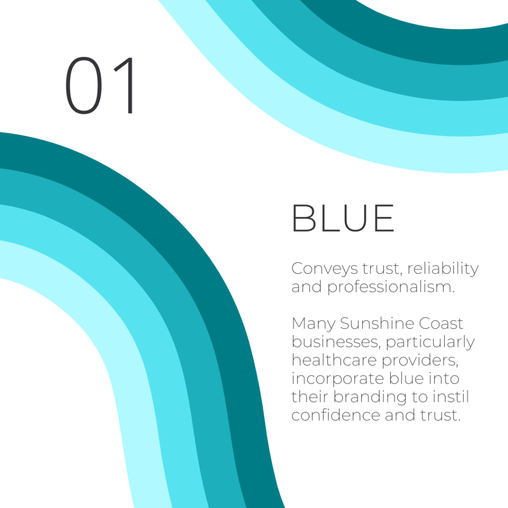
Blue colour tones convey trust, reliability and professionalism. They are frequently used by tech companies, banks and healthcare providers to build credibility and instils a sense of security.
Many Sunshine Coast businesses, particularly those in professional services and healthcare providers, incorporate blue into their branding to build instant confidence and trust with their audience.

Yellow
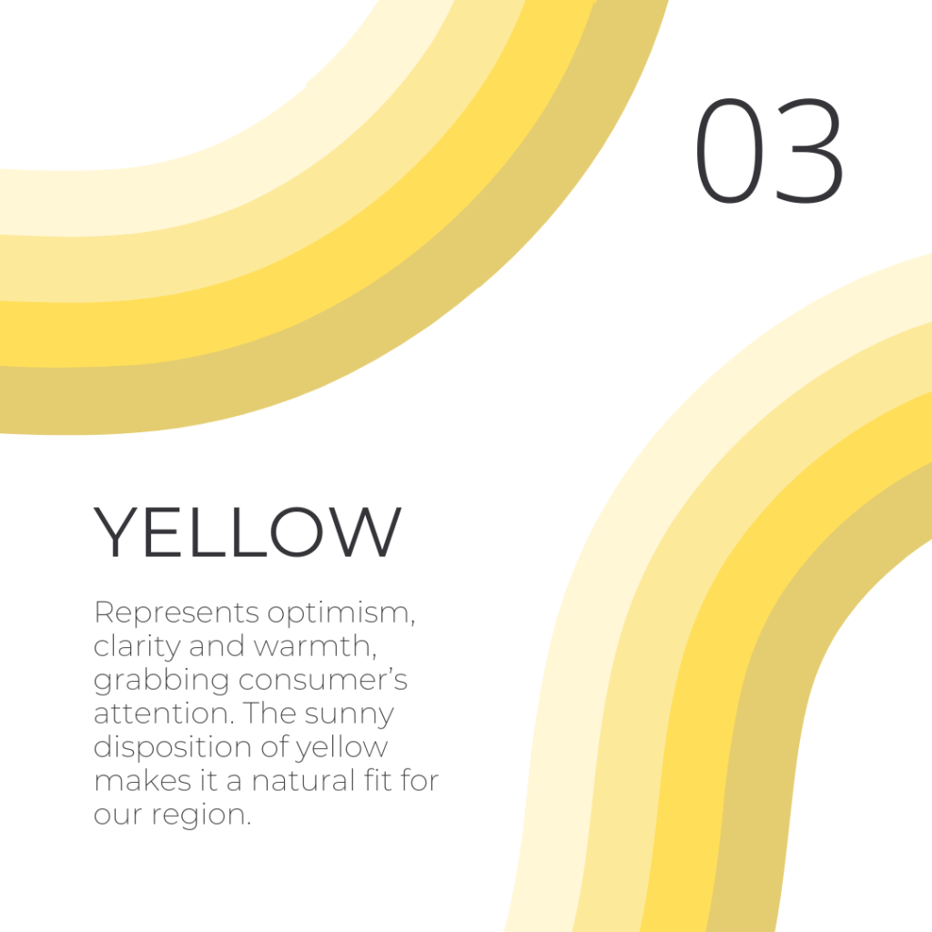
Yellow represents optimism, clarity and warmth. It grabs people’s attention and invites them to take a second look.
The sunny disposition of yellow makes it a natural fit for our coastal region. You’ll often see it used in branding for local tourism operators and family-friendly attractions, reflecting the Coast’s laid-back, optimistic vibe.
Green
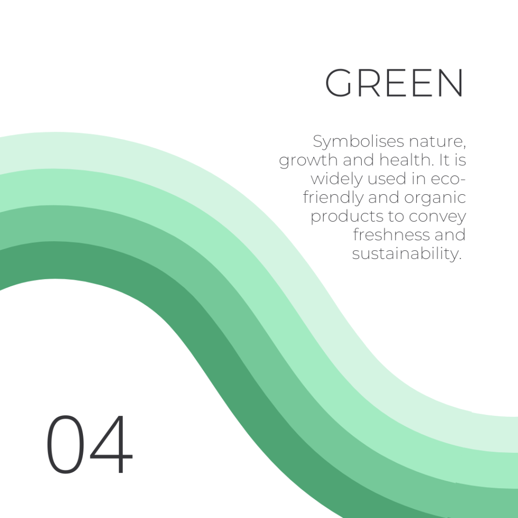
Green symbolises nature, growth and health. It is widely used in eco-friendly and organic products to convey freshness and sustainability.
With our local community’s commitment to preserving our natural environment, green is a prevalent colour in local eco-friendly businesses and organic product lines. Green is also featured in the branding of our numerous farmers’ markets and health food stores.

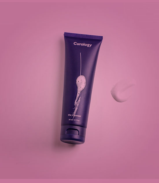
Purple
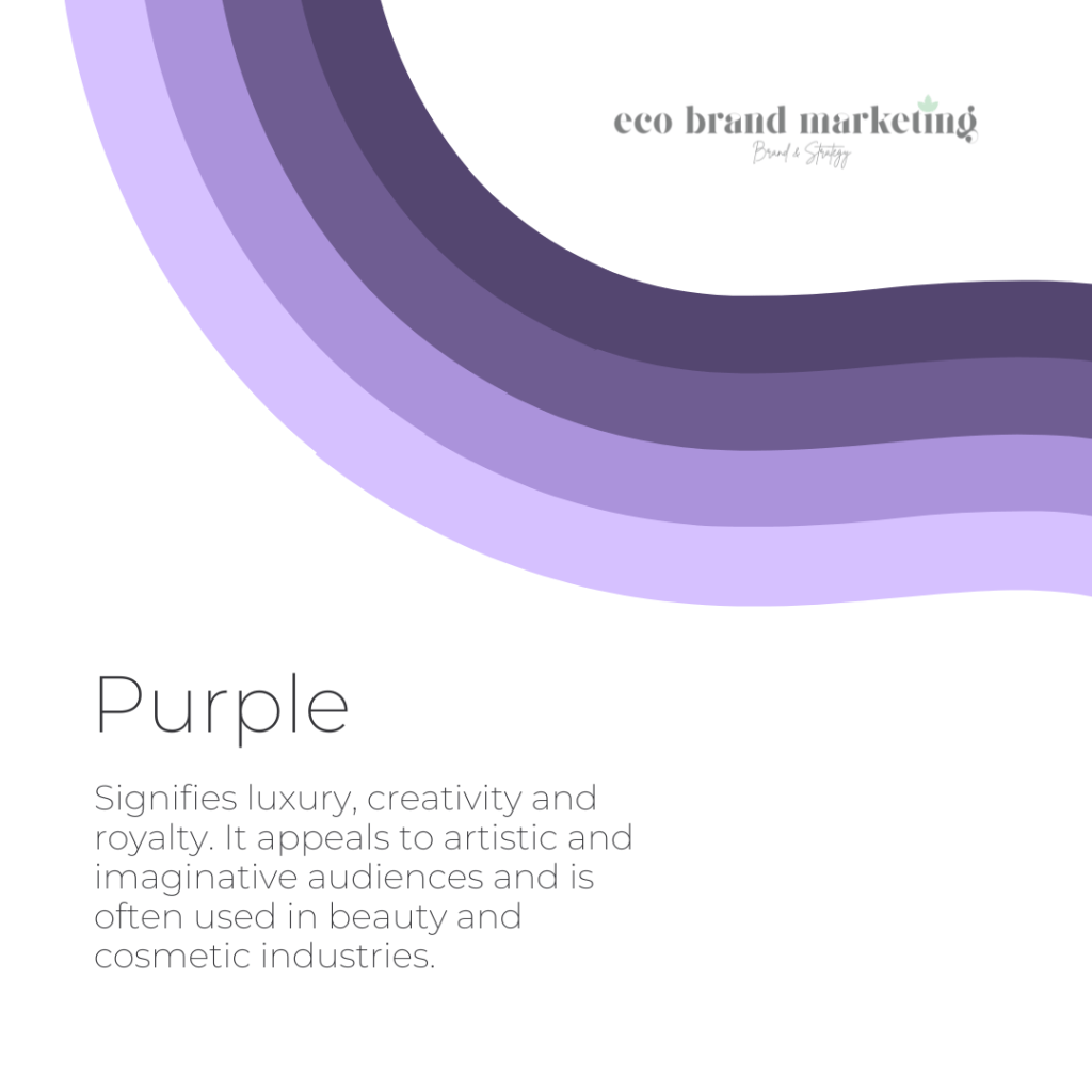
Purple signifies luxury, creativity and royalty. It appeals to artistic and imaginative audiences and is often used in beauty and cosmetic industries.
In the artistic hubs of Maleny and Montville, purple often makes an appearance in gallery and boutique signage, appealing to the creative spirit of these communities.
Applying Colour Psychology in Marketing Strategies
The Sunshine Coast’s unique blend of coastal charm and hinterland beauty provides a distinctive backdrop for local businesses to apply colour psychology in their marketing strategies.
As a business owner, there are plenty of opportunities to leverage this powerful tool to connect with your audience and stand out in the market.
Brand Identity and Logo Design
The colours you choose for your brand logo are foundational to how consumers perceive your business. For instance, brands like McDonald’s use red and yellow to create a sense of urgency and stimulate appetite, while IBM employs blue to convey trust and dependability.
By selecting colours that align with your brand’s values and the emotions you wish to evoke, you can establish a strong brand identity that resonates with your target audience. This is especially important in competitive markets where first impressions can significantly impact consumer decisions.
Website and Visual Design
Your website serves as your digital storefront, making the colour scheme vital for user experience and engagement. A harmonious colour palette can evoke positive emotions and encourage visitors to explore further.
Conversely, clashing colours or poorly chosen hues can deter potential customers. Understanding how different colours affect mood and perception can help you design a website that not only attracts visitors but also keeps them engaged and encourages conversions.
For instance, eco-tourism operators might opt for a palette of greens and earthy tones to reflect the lush hinterland, while beachside cafes could use a combination of sandy beiges and ocean blues to create a harmonious and inviting digital space.
Advertising and Marketing Collaterals

In advertising and marketing collaterals, the strategic use of colours goes beyond mere aesthetics; it serves as a powerful tool to evoke specific emotions and convey key messages that resonate with the target audience.
For example, using warm colours like orange can create a sense of enthusiasm and urgency, while cooler shades like blue can instil trust and calmness. By aligning your colour choices with your campaign objectives, you can enhance the effectiveness of your marketing materials and better connect with your audience.
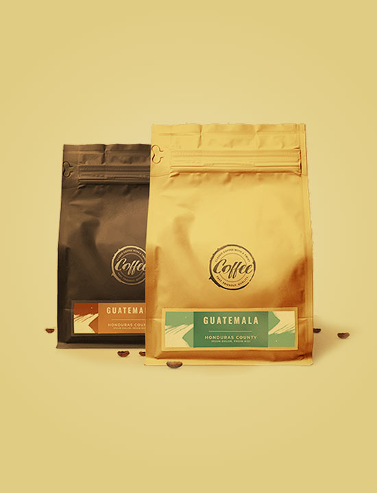
Product Packaging
The colours chosen for product packaging can also influence purchasing decisions. Bright, bold colours may attract impulse buyers, while subtle, calming colours can appeal to consumers looking for relaxation or wellness products.
For example, health-focused brands often use green to signify freshness and sustainability. Understanding the psychological impact of colour can help you design packaging that not only stands out on the shelf but also communicates the essence of your product.
Call-to-Action (CTA) Enhancement
The effectiveness of call-to-action buttons can be greatly influenced by colour.
For instance, green is often associated with growth and harmony, making it effective for CTAs promoting sustainability initiatives. Alternatively, using contrasting colours for CTAs can enhance visibility and prompt specific actions. A bright red CTA button against a neutral background can draw immediate attention, increasing click-through rates.
With a high-contrast CTA button, you can encourage your audience to click for more.
Real-World Examples – Heinz Ketchup Case Studies
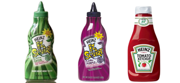
The Heinz ketchup case study illustrates the power of colour in branding. Heinz famously conducted a study on the colour of ketchup bottles and found that consumers preferred their traditional red bottle over green and purple alternatives. Unexpected colours and colour differentiation in a brand can be a bold business move, utilising shock and excitement to draw more attention to a brand.
In 2000, Heinz made a daring move by launching a green ketchup bottle specifically targeted at children. This departure from their classic red packaging aimed to leverage the novelty factor and appeal to a younger demographic. The decision was met with skepticism initially, with concerns raised that the green colour might be off-putting, resembling vegetables and potentially deterring young consumers [1].
To everyone’s surprise, the customer response was immensely positive, gaining an additional $23M in profits. The success of the green ketchup highlighted the potential of unexpected colours in branding to create buzz and generate excitement among consumers.
However, the euphoria surrounding Heinz’s green ketchup was short-lived. As novelty faded and consumer preferences returned to familiar patterns, sales of the green variant began to decline rapidly. This phenomenon underscored the enduring power of red in food packaging, reaffirming its strong psychological association with appetite stimulation and food enjoyment.
The Future of Colour Psychology in Marketing
As consumer behaviour continues to evolve in the digital age, marketers must adapt their strategies to resonate with increasingly diverse and discerning audiences. Advances in technology allow for personalised marketing experiences where colour choices can be tailored based on individual preferences and demographics.
For example, an e-commerce site may showcase different colour variants of a product based on a user’s previous purchases or preferences.
Additionally, with A/B testing tools, you can continuously experiment with different colour combinations to identify those that resonate best with specific audience segments. This iterative process ensures that colour choices are not only visually appealing but also drive higher engagement and conversions.
Attract more customers with colour psychology
As the saying goes, “Colours speak louder than words,” and in the realm of marketing, choosing the right colours can make all the difference in shaping consumer perceptions and driving business success.
At Eco Brand Marketing, we leverage our expertise in behavioural science and marketing to create more impactful marketing strategies that resonate with your target audience on a deeper level. Contact the team at Eco Brand Marketing today.

[1] Won, S., & Westland, S. (2017). Product-specific colour meanings: A semiotic approach. J Int Colour Assoc, 18, 43-59.