If hearing the word “Dopamine” hypes you up, then 2025 is about to be your year. Dopamine Design is storming our castle walls in the form of cherry aesthetic, pickle-coloured nail polish and maximalism.
Although it hasn’t always been met with a warm embrace (Ehm, Jaguar’s new rebrand—we’ll get to that later.) it’s soaking into our daily lives, whether we’re aware of it or not.
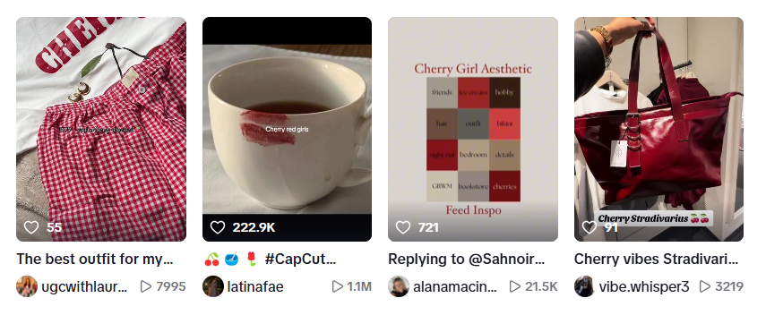
Cherry Vibe on TikTok
Dopamine is often called the “feel-good” chemical in your brain, but it does more than just make you happy. It’s part of the brain’s reward system, which gets activated when you do something good for yourself, like trying a cherry martini for the first time. When your brain releases dopamine, it reinforces the behaviour or action you took that sparked the release of this neurotransmitter.
So how exactly did dopamine design end up on our mood boards? Honestly, because minimalism is boring and we need more joy to get us through the day.
Here’s the tea (a.k.a. How we got here)
Millennials embraced minimalism as a result of the Great Recession period between 2007-2009. Spiralling economic factors forced people to spend less, giving them time to consider the negative impacts of consumerism in the world.
Eventually, these feelings created aspirations to experience the world rather than fill it with more stuff. Marie Kondo became a verb for tidying up your life and “digital nomad” was the new dream job to aspire towards.
“Marie Kondo became a verb for tidying up your life and ‘digital nomad’ was everyone’s dream job.”
Once companies sniffed out Millennials’ hesitancy to spend money, they prioritised aesthetics and experiences that spoke to customer’s need for simplicity. So brand’s gave millennials what they wanted—sort of.
Companies started using words like, “Natural”, “Earth-friendly”, and “Conscious” in their marketing. On top of that, they splashed shades of green, white and beige across their websites and products to strengthen the associations between their brand and the natural world. (More about colour psychology over here.)
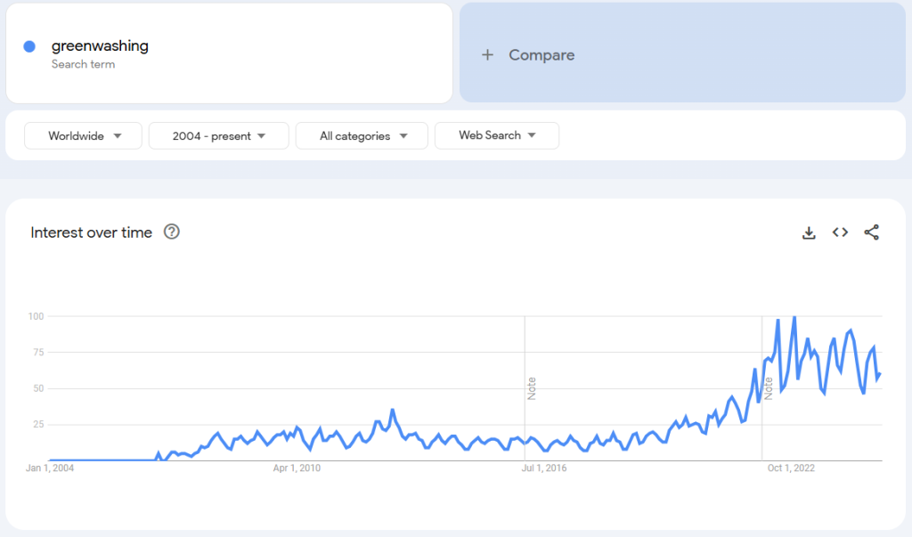
But it all started to crumble when major companies like H&M were found out to be lying about 96% of their eco-conscious claims. “Greenwashing“, a term coined by environmentalist Jay Westerveld in 1986, picked up more momentum than ever before by the time the 2020s came around.
Millennials threw their hands up in the air in protest while Gen Z searched for joy amongst the ashes.
Greenwashing search increase on Google over time
Gen Z Wants to be entertained
TikTok has played a huge role in how we make decisions. If a video isn’t immediately exciting, interesting, or engaging, no one cares. So naturally, this sentiment spilled out into the real world.
After a couple depressing years in lockdown, 2022 arrived and we were collectively exhausted from endless days of sweat pants and deep cleaning our kitchen cupboards. We needed TikTok’s joy to saturate our physical world.
People started trading their sleek, beige trench coats for oversized, fluoro cardigans. Plain grey lamp shades were tossed out and replaced with vibrant yellow tassels. Dopamine design began popping up everywhere and companies took notice.
vogue.co.uk
Scoot over Minimalism, dopamine design is here to party
The need to be entertained, surprised, and delighted supersedes the digital world.
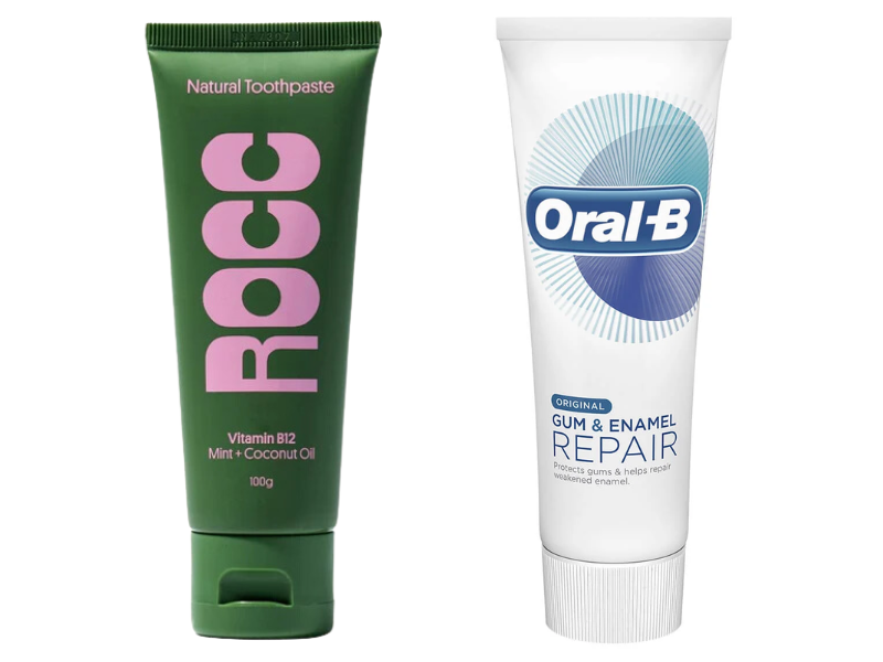
We want to walk through the toothpaste aisle and get pulled into another world as soon as our gaze hits the packaging. We don’t want to discern between the various features advertised across 12 different brands of white boxes.
Just look at the image below and tell me which one makes you smile?
Rocc Toothpaste Packaging vs Oral B
Rocc’s biodegradable toothpaste tube captures my attention immediately. If I saw that in Woolies, I’d claw my way past Oral B and Colgate to get that pickle green and fairy floss pink tube into my hands.
Rocc makes the purchase decision easy with packaging design that steps out of queue and screams, “Pick me!”
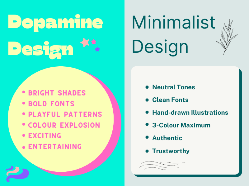
Dopamine design vs Minimalism
Dopamine design’s bright colours, bold text, and fun patterns replace minimalism’s muted tones, simple fonts, and plain drawings.
The #1 goal of Dopamine design is to make you feel good, but not in an altruistic sense. It’s feel good in a this-vibe-is-my-personal-anthem kind of way.
Bright lights and colours give us energy. And with so many things beyond our control in this world, we need that extra pop of colour to get through the day.
Examples of Dopamine Design across Industries
Am I really trying to convince you that your brand can benefit from appealing to your customers’ pleasure centre? Yep.
Once you see the examples below, you’ll start seeing the colour pink as a business opportunity.
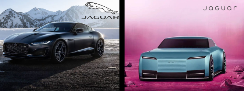
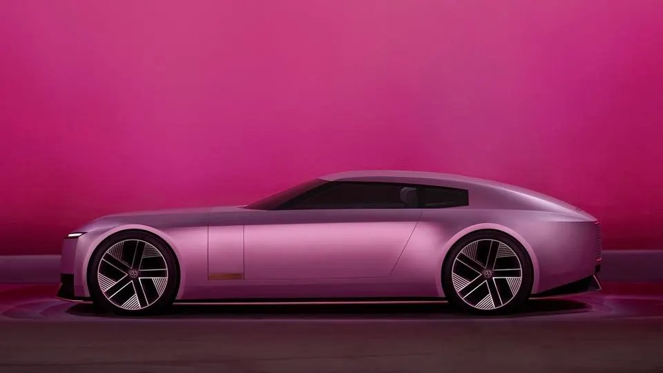
autoMotive: Jaguar
Jaguar Branding – 2018 vs 2025
Bye Tesla, Jaguar has restored my confidence in what driving into the future looks like.
Yes, Jaguar’s 2024 rebrand is still a hotly debated topic in the design and automotive industry. But hey, sparking new conversations can be a good thing when you’re debuting new brand design. Especially if it catches your competitor’s attention.
https://www.creativebloq.com/
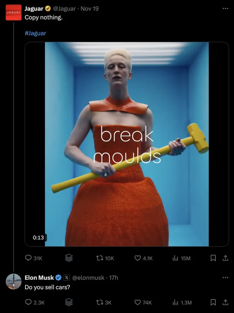
Elon Musk replied to Jaguar’s bold invitation to “break moulds” with a simple tweet: “Do you sell cars?”
But something inside me says: this is exactly what Jaguar’s branding team wanted. A complete industry shake up.
Honestly, I’m here for it. Since I was little girl, I always wondered why cars look mostly the same. Humans spend hard-earned dollars to convey their personality through clothes, jewellery, Instagram posts and Crocs Jibbitz. So, why don’t we tie-dye our cars?
But nope, there’s an unwritten rule that car bodies need to be one of four shades of neutral.
“Miami Pink” and “London Blue”, Jaguar’s new shades, may not be for everyone, but looking at them sure makes me happy.
That’s the whole point of Dopamine Design. Looking at it should overwhelm your brain with good feelings. It’s an instant emotional response you don’t have a logical choice over.
Miami Pink Jaguar – Jaguar.com.au
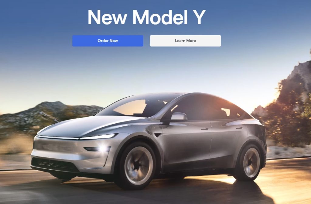
Maybe Tesla’s image below gives you feelings of safety, reliability, and dependability. But that’s an age old marketing trick to make you forget that Teslas also come with privacy and long-term reliability concerns.
With 50 million people worldwide choosing to be a digital creator, more people are spending time in their apartments or homes while they spin up new content.
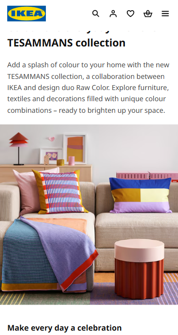
As a result, we’re reaching for more eccentric furniture to decorate our homes with. Bright colours inspire creativity, plus, they look great on our Instagram feeds. IKEA taps directly into this need by advertising their Tesammans collection as: “Bursts of colour to keep creativity and inspiration flowing”.
IKEA’s new dopamine decor also invites us to “Make every day a celebration.” It’s all about making your home environment a place where you can create, socialise and relax in.
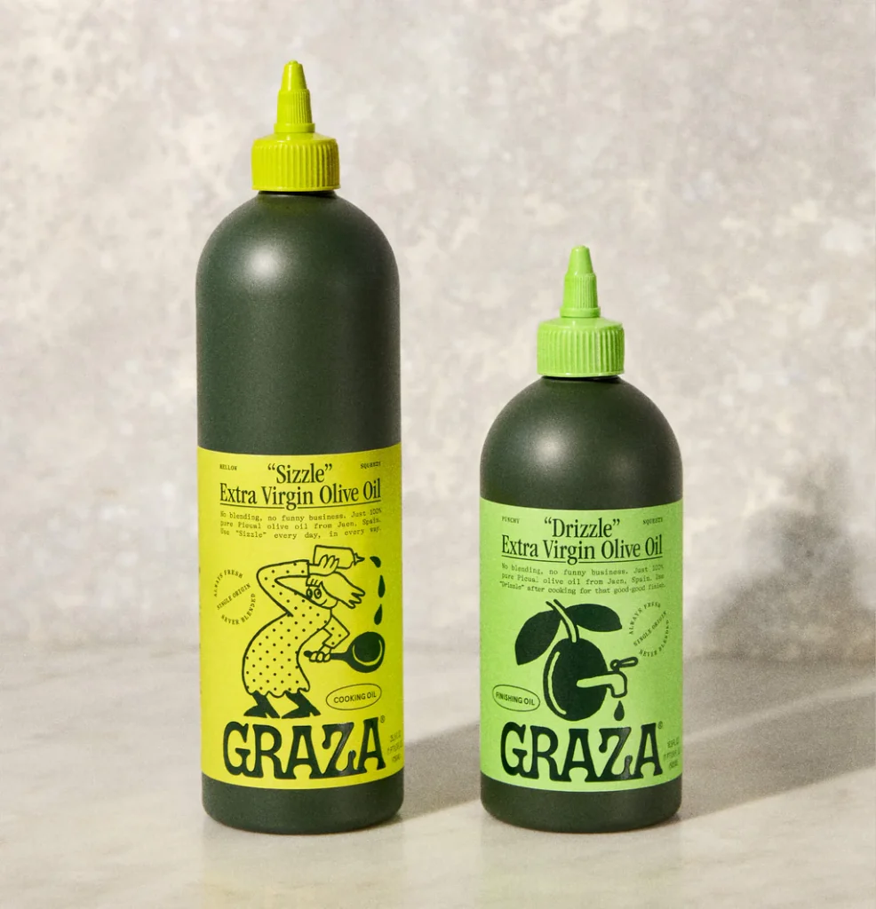
Graza Olive Oil hype is real with seemingly every chef on TikTok and Instagram using it.
It’s packaging design is fun, fresh, and doesn’t take itself too seriously. Plus, its tomato sauce inspired squeeze bottle is a refreshing alternative to drippy, circular screw tops.
Hear me out. Imagine heating up your egg pan in the morning and squirting smiley faces of olive oil across the surface FUN!
Graza turned a simple, every day product into an experience.
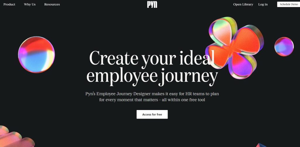
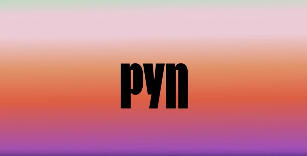
Tech: PynHQ
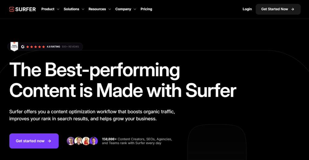
B2B services are everywhere online, offering platforms and tools that promise to simplify our lives. But there’s an unwritten rule that their websites must contain as little colour as possible:
SurferSEO website
Pyn scrapped this notion and instead opted for a colourful melt of sunset hues in their branding.
To top it off, they accent their home page with playful, psychedelic shapes that are arranged asymmetrically on the page.
Although their overall website design isn’t a major departure from the typical B2B landscape, their chosen pops of colour create a home page that still stands out.
Their website’s bubbly type face, asymmetrical patterns, and sunset colours make it a retro paradise on the internet. Once you land on their page, I guarantee you’ll be searching for their address.
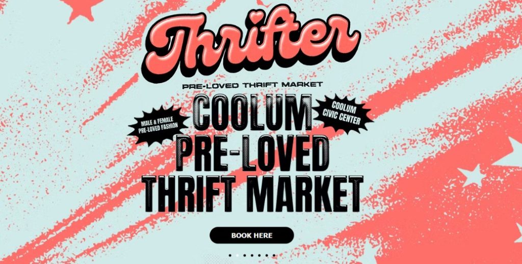
Without all these colourful details, Thrifter might be mistaken for just another stale op shop.
Nope. Their thrift market is unique so they went out of their way to be unique wherever their brand shows up.
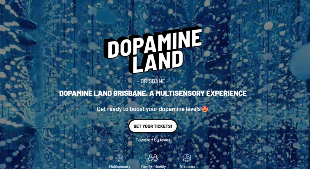
Alright, if you still think I’m making this trend up, look at Dopamine Land.
Dopamine Land promises a multisensory experience “to boost your dopamine levels” using media, technology, and play.
This ticketed experience offers you full access to rooms like, “Sunset beach”, “Galaxy of Lights”, and “Woodland Wonderland”.
Plus, if you go to their website, you’ll be greeted by a glittery welcome video and an orange background that I swear makes me feel like I’m watching the sun rise.
The creators of Dopamine Land turned this TikTok trend into a profitable reality.
3 Ways to fuse Dopamine Design into your brand
If you’re looking for ways to make your business stand out in 2025, here’s a few tips for captivating attention with dopamine design.
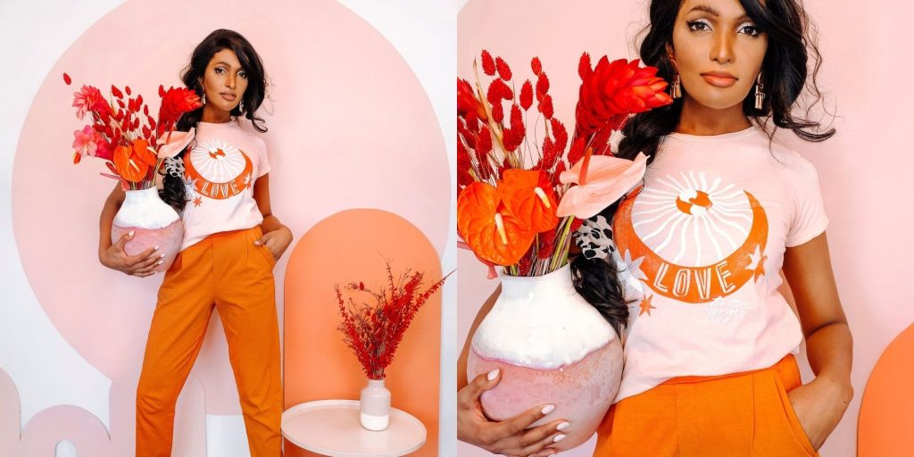
1. use vibrant colours
Dani Dazey for the Maximal Lifestyle
Drizzle bold, saturated colours like neon pink, sunset orange, and banana yellow over your Instagram feed. These tones can trigger positive emotional responses, engaging your audience’s brain in a way that mimics the “dopamine hit” response.
If you’re worried about straying too far from your current branding, use a tool like Adobe’s colour wheel tool to find colours that complement your existing palette while adding a fresh hue or shade.
Gradients, particularly neon or pastel gradients, produce smooth transitions between colours and are visually stimulating. They give a sense of depth or movement to design and encouraging engagement.
Canva’s gradient palette generator can help you create a branded gradient that matches your business colours. After choosing a few shades for your gradient, export the design and experiment with placing your logo or brand font over it.
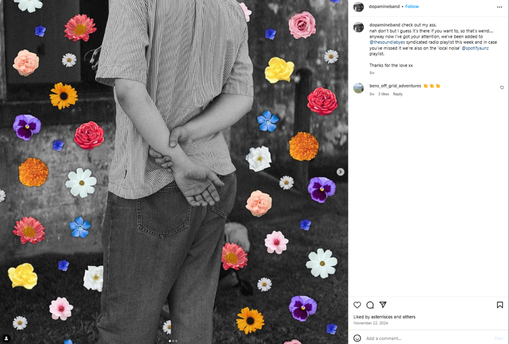
3. Play with patterns
Dopamine Band’s Instagram post
Accenting your brand with patterns that don’t “match” will get people talking in no time. This one may can be tricky to achieve since there is a fine line between captivating and overwhelming.
A few tips for incorporating patterns into your brand design:
Play with patterns that feature the 1-2 of the same colour hues
Choose one shape (e.g. stripes, polka dots, leopard print) and find patterns featuring different designs of this one shape
Create a Pinterest board for pattern inspiration. Search terms like “mismatch outfits”, “pattern play”, “animal prints”, or “maximalism”.
The information provided in our blogs and articles is for general informational purposes only. It is not intended to constitute professional business advice or recommendations. Any reliance you place on such information is strictly at your own risk. Readers should not act or refrain from acting on the basis of any content included in this without seeking appropriate legal or other professional advice.
In our blogs and articles, you may be able to link to other websites which are not under our control. We have no control over the nature, content and availability of those sites. The inclusion of any links does not necessarily imply a recommendation or endorse the views expressed within them nor the security. We expressly disclaim all liability in respect to actions taken or not taken based on any or all the contents of this newsletter.